Added 1 new A* page:Trying to rein in all the color experimentation I've been doing and start to hone it to something sharper. Since I realized a few days ago that I can do the watercolors *over* the inks without getting either one muddled up--rather than doing the watercolor first, then inking over that--I've been trying to ink the page as best I can as a stand-alone thing--as if it was going to go out as pure black and white, I mean--and once that's done, consider what color can do to help the black and white get its message across. How to limit the color was confuddling me at first but I think I'm starting to get the picture.
I've also been trying to work on the black and white itself, keeping the linework light and brisk, and contrasting that against thick, rough shadows--ideas I've been getting from the Rip Kirby strips I've been looking at, primarily. Yesterday didn't seem to work that well but I think today's was more successful in that regard. Here are a couple progress stages in the inking:
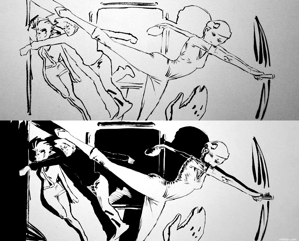
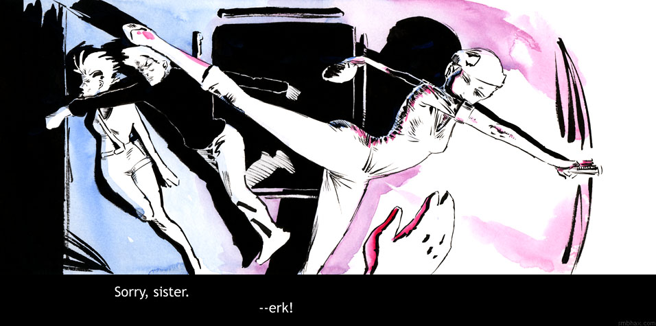
This particular sequence with four characters per panel across a long expanse of corridor has been interesting with regards to the role of color, because it's seemed to me to be pretty darn tough to get the sense of the corridor's depth or extent across in just black and white; and I think even grayscale would struggle with it, because while with grays you can pretty easily illustrate near vs far, you can't very easily do another dimension along with that, and with all these characters I've needed near vs far AND left vs right, if that makes sense. So I'm finding the color can take care of that extra dimension. Compare, for instance, the feeling of the pre-watercolor version of the page in the image just above with the final, colored version, and I hopefully you'll be able to see a bit of that extra dimension or two I'm talking about.
My color use still has a long way to go, but the goal is to have it accentuate the black and white, rather than diminish it--hm and hopefully I'm not just using it as a crutch for lazy composition!
~~~~~
UPDATE: Having said all that, and sitting here flipping back and forth between the color and black and white versions... I think I like this page better in black and white. There's a power about it, particularly the left side between the Major and the guard. And while it's easier to lose track of depth in black and white, that's also part of the abstraction I like about black and white. Hm. So for now I've replaced the colored version of the page with the black and white. Here's the color one; which do you prefer?
|