 | |
| |
|
|
| |
| Dip Pen Adventures, Part 2 | Feb 16, 2012 7:07 AM PST | url |
| | |
Added 1 new A* page:The art supplies I got that have not been so successful have been parts for dip pens. I got some from the local art supply mega-store recently, but the ones I could use (I was missing a handle for a few of them) weren't quite the type most comic inkers use, as it turned out; so I ordered the right ones and the right handles. (The helper lady at the art supply store was nearly as clueless about them as I was, unfortunately; here's an example that will show experienced dip pen users just how ignorant we were: I asked "Do you have Hunt nibs?" and she replied "No, we just have Speedball"; those who know their stuff will know that those two are one and the same, at least since 1997 when they were all put under the "Speedball" brand, which also covers other things like inks and so forth--the confusing thing though is that the packaging says only "Speedball," and the nibs themselves have only "Hunt" engraved on them (which is hard to read through the packaging). Pretty feeble rebranding effort there if ya ask me, and one that leaves noobs such as myself confused.)
So the doodles I showed in that recent post were made with a "22" nib, which is too big and too rigid for proper comic work; it was also chewing into even the heavy paper and Bristol I tried it on if I tried inking over the same spot a few times, as you would want to do to get a solid black area, or for crosshatching. Not cool! So I was hoping the smaller nibs comic artists use would be more forgiving on the paper, and also easier to move around and use for a variety of line widths and styles.
Well, here's the result of my attempts with the little nib collection I now have--I've placed the nibs themselves next to their identifying number, and the doodles around that area of the paper were done with that same nib:
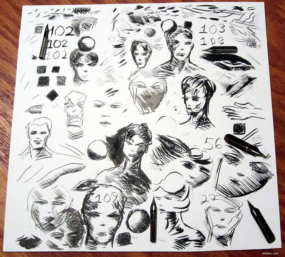
Blech! Anyway... The "102" in the upper left is the "crow quill" you may see some inkers talking about--it's probably the most commonly recommended for comic inking, at least that I've seen on the internet. It's small but pretty darn stiff, and with two or three cross-hatches would start chewing into the paper with its needle-like point.
"103" (upper right) was recommended in that book on inking by Klaus Jansen, and it's nice and flexible, but the ink just doesn't seem to want to come down from that cross-shaped reservoir (when you dip these into ink, a drop of ink collects at the hole above the tip, and is supposed to flow down the nib when you apply pressure to spread the two halves of the nib apart slightly)--I spent a *long* time trying to get it to flow consistently, and tried three different 103s, but just couldn't get them working reliably; plus, the tip is *so* flexible that I bent two of them (the halves of the nib wouldn't snap back together without a gap), and in testing the third one just to see what would happen if I applied just a *little* more pressure than one would think to do, **PANG!** half of the nib snapped off and darn well could have put my eye out. And anyway even though it was really flexible, it would still chew into the paper a bit on repeated crossings.
"109" (lower left) was probably the most successful--somewhat flexible, without ink flow problems--but yep would still chew up inked paper; you can kind of see it in the darker blotches in the heavy black areas I tried to make.
"22" is a big, fairly inflexible nib that I had before and used to make the doodles shown under the first link in this post; I kind of like the loose, thin lines you can get when moving it with very little pressure, but its big size makes it even more paper-chewy--although it is topped in that department by the even bigger "56."
Well, I'm probably doing this wrong. It isn't coming intuitively like the brush and pencil do--although I've used those extensively before, so it's just as likely simply a matter of familiarity and practice, or lack thereof--and the way you can only move the tip in certain directions due to how its knife-like tip moves on the paper feels uncomfortable and restrictive. I want to be able to make the type of hard lines these nibs can do that a brush can't really, but I don't think I'm gonna be able to jump in and do that with them; and anyway I suspect the chance of chewing up the paper with the tip will always remain, especially since what I really want to do with them is loads of overlapping cross-hatching and hard, dark, blocky areas; I wonder if this happens to the pros (and I don't see how it can't, at least once in a while)--I suppose it doesn't really show up in their scanned linework anyway, since (I think?) the usual method of getting linework ready seems to include using 50% Threshold in Photoshop to simplify it to pure black and white, which would make the chewed-up areas just as black as the non-chewed-up areas. But you can't do that with ink wash, and anyway I want my originals to look nice, since I plan to sell them and don't want people to be disappointed with how they look in person!
So this is probably the end of my flirtation with dip pens for the time being. I tried doing some semi-"hard" lines around the figures with this new brush of mine on today's A* page, and was surprised how successful it was at doing a thin, fairly steady line. It still isn't quite nib-sharp, but I've got another tool waiting for me at the post office that should be, so maybe I'll get a chance to play with that tomorrow.
|
·····
|
|
|